
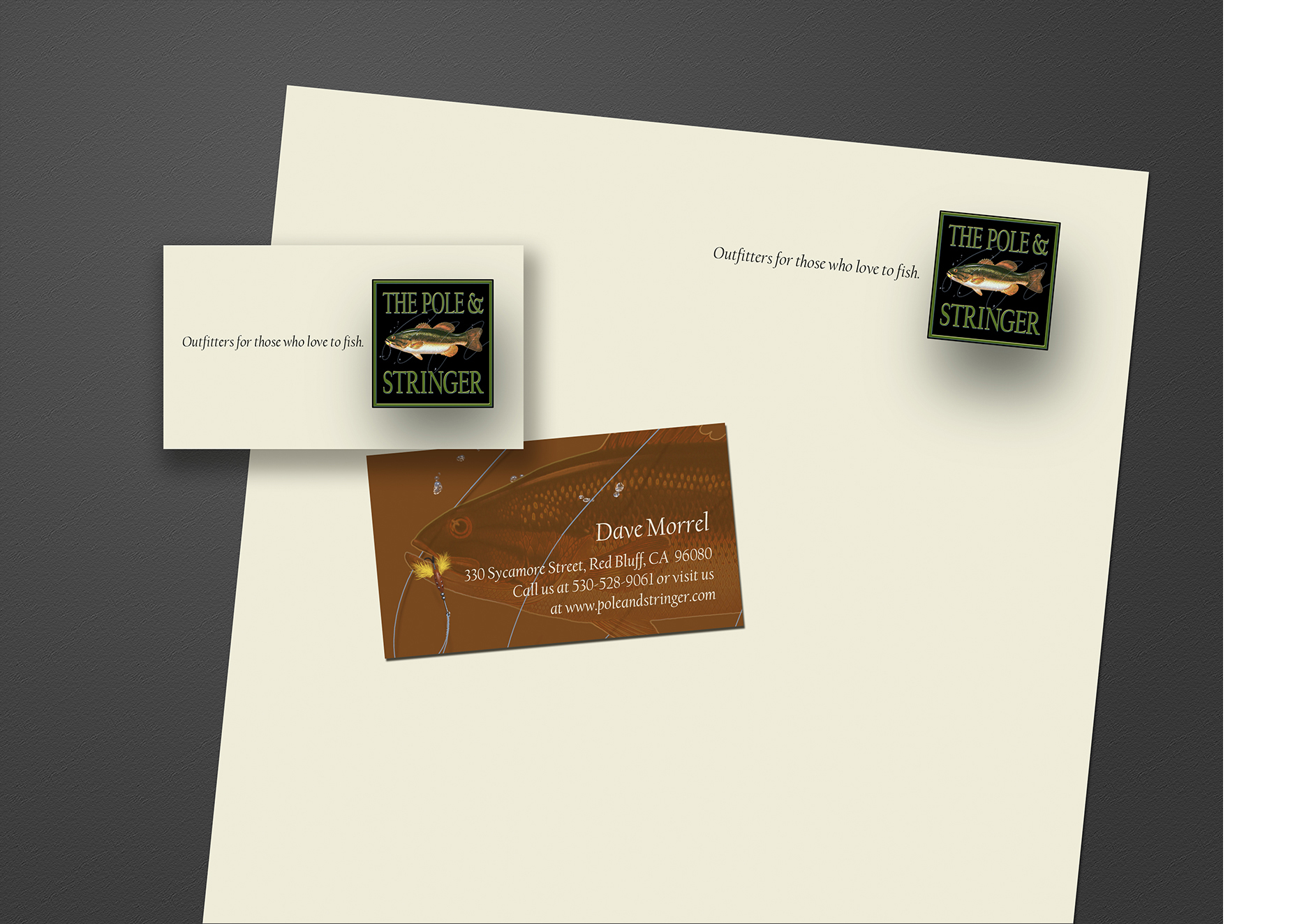


Dave is a passionate fisherman and like a lot of people with a passion he dreams of making a passable living doing what he loves. His love of wetting a line grew into informal fishing expeditions with friends and then paid excursions with others as his expertise became known, primarily by word of mouth. He then wanted to deal in the kind of tackle he'd found to be particularly satisfying.
Click upper right + on images to view enlarged without copy.
I came up with the name and created the logo for his shop along with a business card and even stationery (which I doubt he uses often). I even reserved a website url for him and if things go well he might have the logo on a sign soon. If you're ever in the Red Bluff, California, area with the desire to catch the big one Dave knows the back country's best fishing holes. For a small fee he will share his secret spots with you and sell you the tackle you'll need for success.
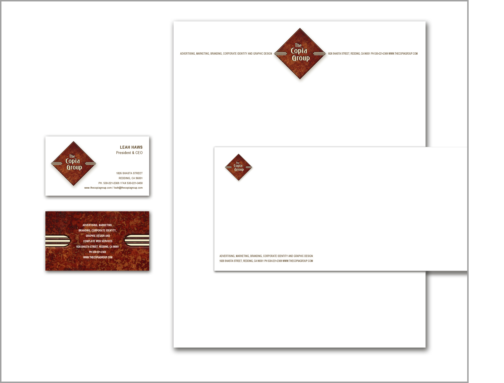
While living in Redding, California, I had the pleasure of meeting some people with whom I had visions of starting a small full-service ad agency. I came up this this name which, loosely translated from Latin, means an abundant and ready supply of language or something to say or write to persuade. It's a word infused with the notion of expansiveness, amplification and abundance...kinda like advertising!
I designed business cards and stationery, had a web guy associate ready to get us up online. All the parts were falling into place...except for the economy. Already in a part of California suffering from chronic unemployment the housing collapse made launching a virtual impossibility as we lacked one critical imperative: clients!
This is a logo I designed for an upscale housing development in Mountain View, California.
As far as I can tell this division of Dana Holding Corp never became the eco-friendly recycling operation for which I originally designed this logo. I have no idea what happened with the effort but I liked my design well enough to keep it in my portfolio.
I designed the logo, stationery, business cards and this small poster for a Salt Lake City, Utah, area solar power company.
I freshened up this logo for a mission in Redding, California. These people do wonderful work for the needy of Shasta County in northern California. Their logo dates from the 60's and was looking a little shopworn so I gave it a polishing without loosing its well-recognized and appreciated character.
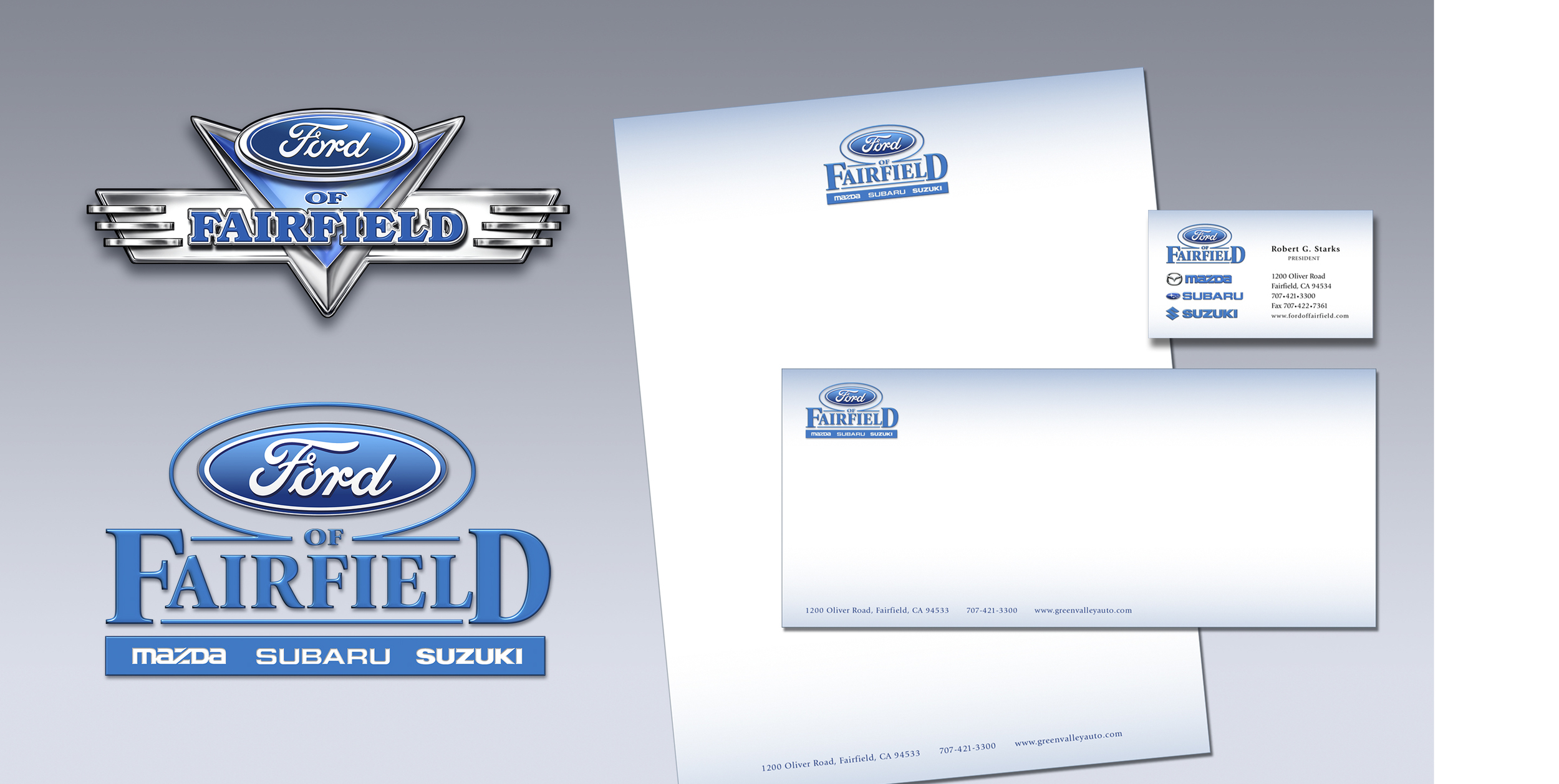
I designed and illustrated this pair of logos for a Fairfield, California, car dealership that regularly sponsored antique car shows at the dealership. He wanted both a “modern” logo (bottom left) and one that captured a bit of the old “big chrome” era of automobiles (top left) to use on banners and promotional materials at the events. On the right is my design for his stationery & business cards.
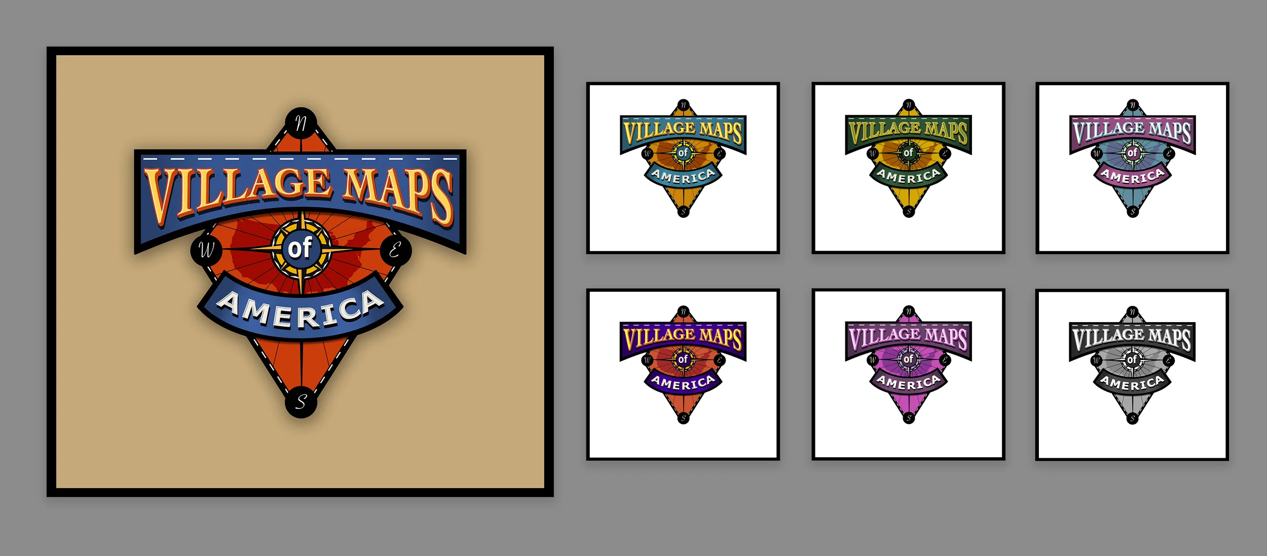
For this digital maps startup company the client was quite set on a “Disneyland” look. As she explained their maps were to have a theme park kind of look - brightly colored - like the type of map you would get at the entrance to guide you around the park. This was my first design which the client liked but she felt there should be “more of it, more going on visually”.
I did what I was asked to do laying the initial design on a background and massaging the type in various ways for effect. Then came the request for a “village”, but really a cityscape, as that would be their primary clientele. Then came the “parchment”. Though maybe appropriate for a Disneyland theme ride I felt the design was becoming too much Disney, straying too far from the somewhat more serious urban business maps they were planning on developing. Playful, ok, but I felt this was getting too far off the mark. I asked the client to let me take another shot to see if I couldn’t find a more satisfactory solution. Luckily they agreed.
Here is the second design I presented. It retains a bit of that Disneyland signage feel but is more urbane...less theme park and more business park. I took my inspiration from the stamped metal signage of the early to mid 20th century, but presented as more of a flat graphic than a three dimensional stamped sign. I tried it in a variety of color combinations as well as black and white. They liked the design but wanted to see how I might be a little playful with it...
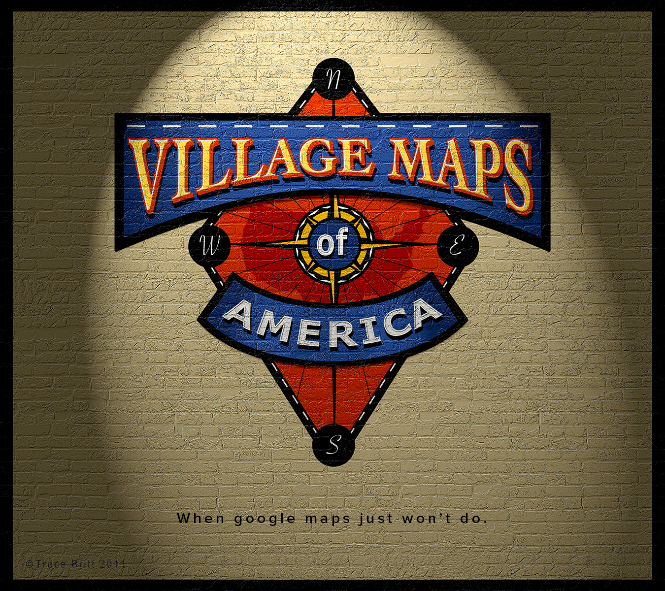
Preferring the original color combination I placed the logo on a urban brick wall under a spotlight or streetlight. It felt right...right enough to keep this presentation for the business card image.
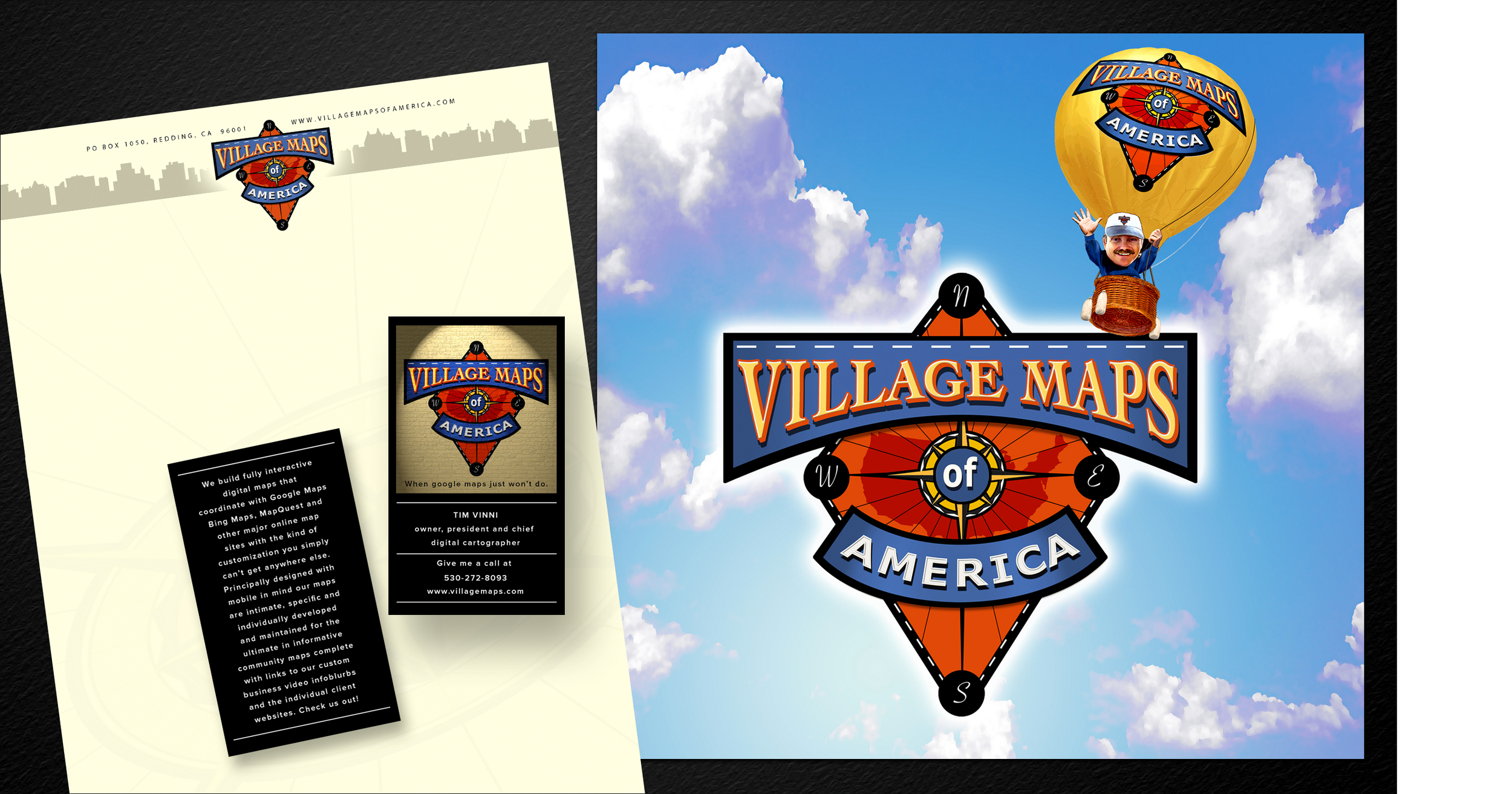
I went on to develop some stationery ideas and graphics for their planned website. As I understand it sometime later the effort was absorbed by MapQuest with the chief designer being offered a job he just couldn't refuse. I had been compensated for my work and I haven't heard anything since. Perhaps Village Maps will rise again within the MapQuest corporate framework. At any rate I’m proud of the logo and the look we had developed. Ok, yes, maybe the hot air balloon is a bit over the top.
Adrienne (or the Pie Lady as she was known locally) was something of an iconic figure in her hometown of Redding, CA. Having started her business baking pies for charities she developed her business into a thriving commercial bakery. This is the logo I designed for her.
Here are the business cards I designed as well as the graphics for a delivery truck. If you're ever in Redding you've got to stop in for a taste of "The Perfect Crust". Oh, and the fillings are really good too!
I've included this logo along with a bit of my process to get to the final design. The logo was never used as the firm went in a different direction but I liked it and the thought process I felt was worth presenting.
Now I'm not making this up but I designed this logo for a Pigeon Forge, Tennessee, dinner theater inside an upside down building called Wonder Works. It was never used but I have to say with all humility that it's way better than what they settled for! Sorry, I just had to get that off my chest.